During the week from March the 24th until March 30th we are celebrating the first Museum Week on Twitter. With the hashtag #museumweek, this initiative aims to bring together all those interested around the art world and different internationally museums.
We are monitoring all the tweets with the hashtag #museumweek since the afternoon of March 23rd to analyze all the relationships within the Twitter users that have joined this initiative using a Social Network Analysis approach. This report includes the tweets published until Thursday morning 11 AM. Next week we will publish another post with the final review of the entire #museumweek that will finish on Sunday 30th.
We have analyzed 104.336 tweets in total, tweeted by 29.220 users. Moreover, 9.941 of these users have been mentioned or RT’d with the hashtag #museumweek.
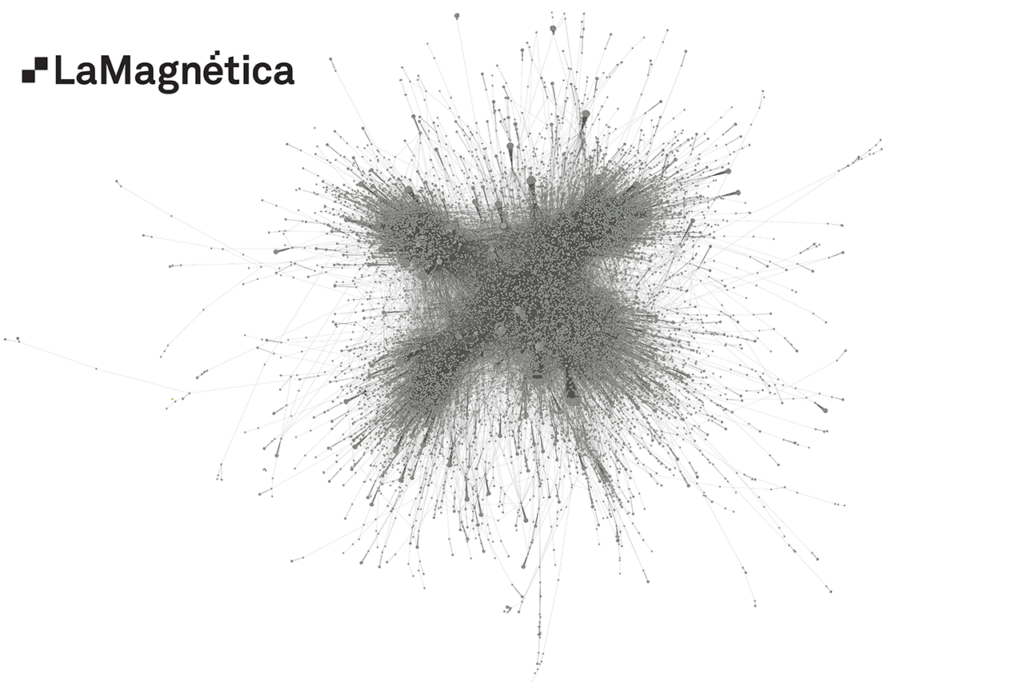
The result for the 29.220 users who have taken part until now is the following:
We have to focus on the core of the conversation to offer a good visualization. That means, erasing the noise and profiles with just one tweet mention to being able to plot the results.
Actually, the result includes up to 2.083 groups who are not connected to other groups. But as it tends to occur, most of them are formed by a single user or formed by a few of them. There are also some spam tweets that want to gain visibility using the hashtag. We will focus on the main component that includes the vast majority of users who have taken part.
If we focus on the main component, we have the next network or graph:
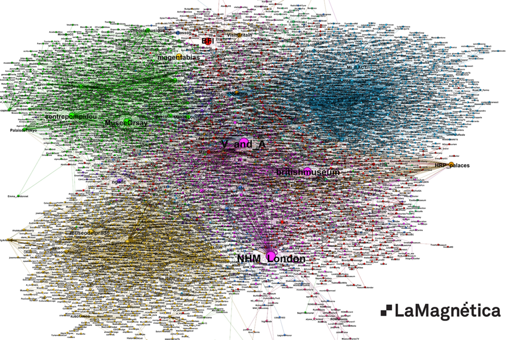
It is still too dense to see anything, because of the amount of profiles names overlap and it’s difficult to see a neat structure.
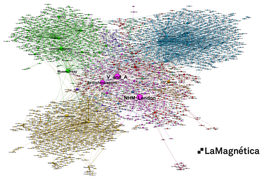
We have applied a filter to include only these profiles that have been mentioned or who have mentioned other users two or more times, and we eliminate Twitter own profiles and those profiles who reply automatically. This action allows us to maintain almost all the profiles that have taken part of the action with more than one tweet, and have a much neater and useful graph:
Here you have high-resolution image of the graph: Download
At a first glimpse we can distinguish perfectly different user’s communities that interact between each other with a higher intensity. And if we observe these communities, we can see they are strongly country-related: United Kingdom (pink), Spain (yellow), France (green) and Italy (blue).
This is no surprise if we take in consideration that a huge part of the dialogue is made in different European languages and between museums and their immediate followers.
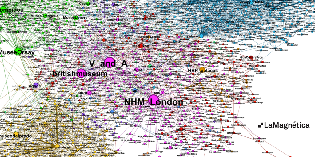
And if we take a deeper look we will see another interesting observation: communities of Spain, Italy and France are placed on the periphery of the graph, and the central group has a majority of users and museums from Britain (although there are museums and users from other countries). This shows a fact that we already saw when we analyzed relationships amongst museums around the globe. Being the English the world language, Spanish museums interact more with the British ones than with French or Italian ones. This also allows the Britain museums (apart from the good job that they realize on social networks), to be in the middle of the European network.
Here you have high-resolution image of the graph: Download
Top users
Let’s see now the most relevant users within this particular initiative. We have created 2 different ranks showing two different ways to measure the relevance.
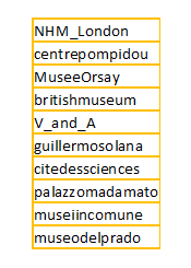
Ranking by mentions received:
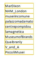
Ranking by centrality. It allows us to see the profiles that are best placed in the graph; the ones who have the rest of users closer. These are the key profiles for transmitting the information between users or groups of users apart.
The difference between these two lists allows us to see what we are measuring in each case.
The first list is formed by 9 museums and Guillermo Solana, Artistic Director of the Thyssen-Bornemisza Museum. These are the museums who have been answering people’s questions.
Then, in the second list, there’s a mix between museums and users who have been particularly active within the #museumweek like Mar Dixon. The fact that @lamagnetica appears on the 6th position allows us to show this difference in a better way. In the list of received mentions, @lamagnetica appears around the position 200, and this is normal, because we have been talking about #museumweek, but we are not a museum. But as long as we have received mentions and RT’s from important museums from different countries, we are closer to the vast majority of users and that allows us to climb up to the seventh position in the second rank. This is, for example, the same situation but in a larger scale that other users like @mardixon have as well.
The diameter of the graph is a 5,5. That is, the average distance between two users. This is almost exactly, the folk culture Six Degrees of Separation that originate in a Stanley Milgram experiment made in the 60s, being the result of that study 5,5. The maximum distance on the graph’s diameter is 15.
This is a smaller distance than we could expect from an initiative were so many interactions are made within the same country, and that is reflected by the graph. It is also a good indicator that there has also been a significant amount of interaction among museums from different countries.
Next week we will publish some other posts with the results of the analysis of the complete #museumweek, and we will also publish some others using two countries as case studies. This fact will allow us to show with much more detail the communications that are taking place within museums and people.

