During the annual Museums and the Web Conference held from April the 2nd until April the 5th in Baltimore, La Magnética presented a Lightning Talk about the behavior of the museum’s community on Twitter for almost a year. Soon we will publish the full paper, based on the data of a whole year.
In order to know a little bit more the relevance that this conference has had on Twitter, we have monitored the hashtag #MW2014 during the event and the previous weeks. This post focuses on the network of interactions that have taken place around the hashtag, like we did with the Museums and the Web Florence event, and with #museumweek.
Network of interactions
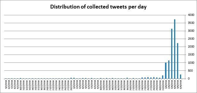
Since we started gathering data of the hashtag #MW2014 (February the 5th), we have collected a total of 14.640 tweets[1] from 2.280 users. From these tweets, an 87,6% were published between April the 1st and April the 6th
Every user has published, on average, 6.42 tweets using this hashtag. This average is higher than the Florence’s conference one.
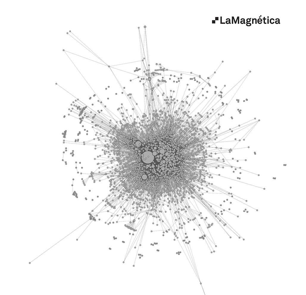
We intend to analyze the interrelation among the users of this hashtag. In order to do so, we create a graph where every node represents a user, and a link between two of these nodes means that one of the users has mentioned or retweeted another one in a tweet using the hashtag (the top of the arrow shows de direction of the mention). With this in mind, we have the following network:
In order to have a clearer vision of this network of interactions, we are going to remove the links composed of just one mention sent or received. Moreover, we are going to paint the graph according to its modularity, which is what will allow us to analyze the graph’ structure and highlight the different communities and user’s clusters using colors.
Here you have a high-resolution image of the grap: Download
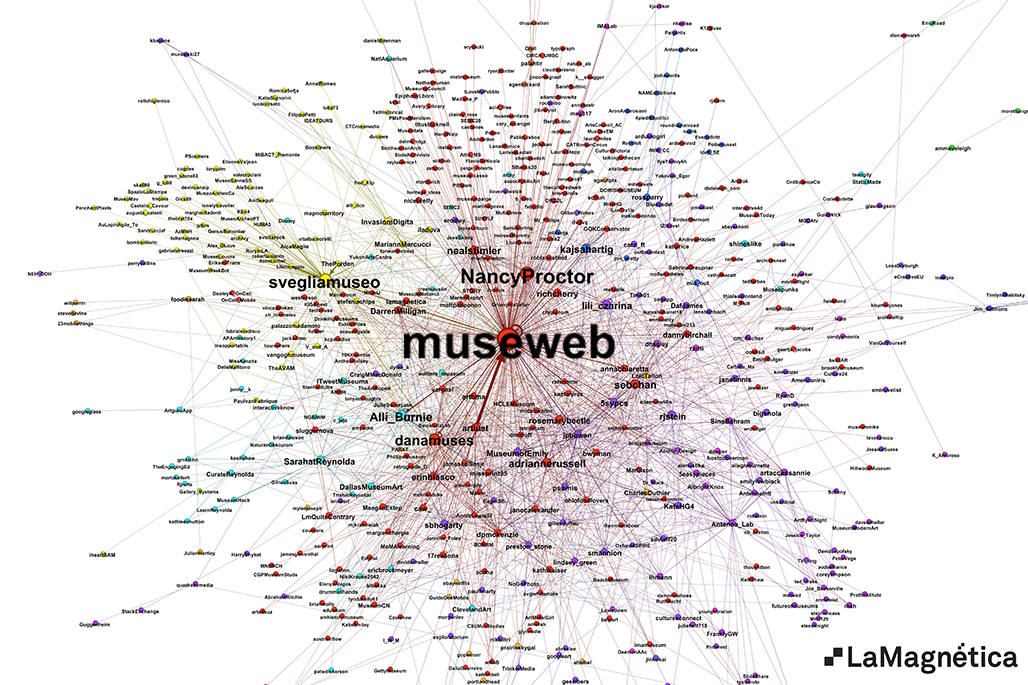
The diameter of each user’s node is proportional to its PageRank in the network. The PageRank is a graph centrality measure. This indication shows the relevance of each user in the context we are analyzing, not the number of followers that a user has.
At a first glimpse we can see that the museweb profile (Museum and The Web official profile) is the most relevant one, both from a PageRank point of view and in sent/received mentions (10.27% of the sent/received mentions involve @museweb).
If we focus in the clusters and communities distribution, represented in the graph using different colors, we can draw 2 conclusions:
- Color division does not show a clearly defined group structure, as opposed to Florence’s graph. This means that most relevant users are connected to @museweb and their other connections do not follow a clear pattern. This may relate to two facts: the conference maturity, and the fact that most of the attendees were from the US, and the UK was likely the second country group. So, we have a community already formed and the vast majority of tweets published in English. These two circumstances were different in the Florence’s conference, which was the first edition and, despite having a very important Italian group, there were attendees and tweets in English, Italian, French, Spanish, Russian, Dutch and Nordic languages. The language/country disparity was one of the key factors in the community creation. These differences are what give the Baltimore graph a denser, yet less defined, pattern.
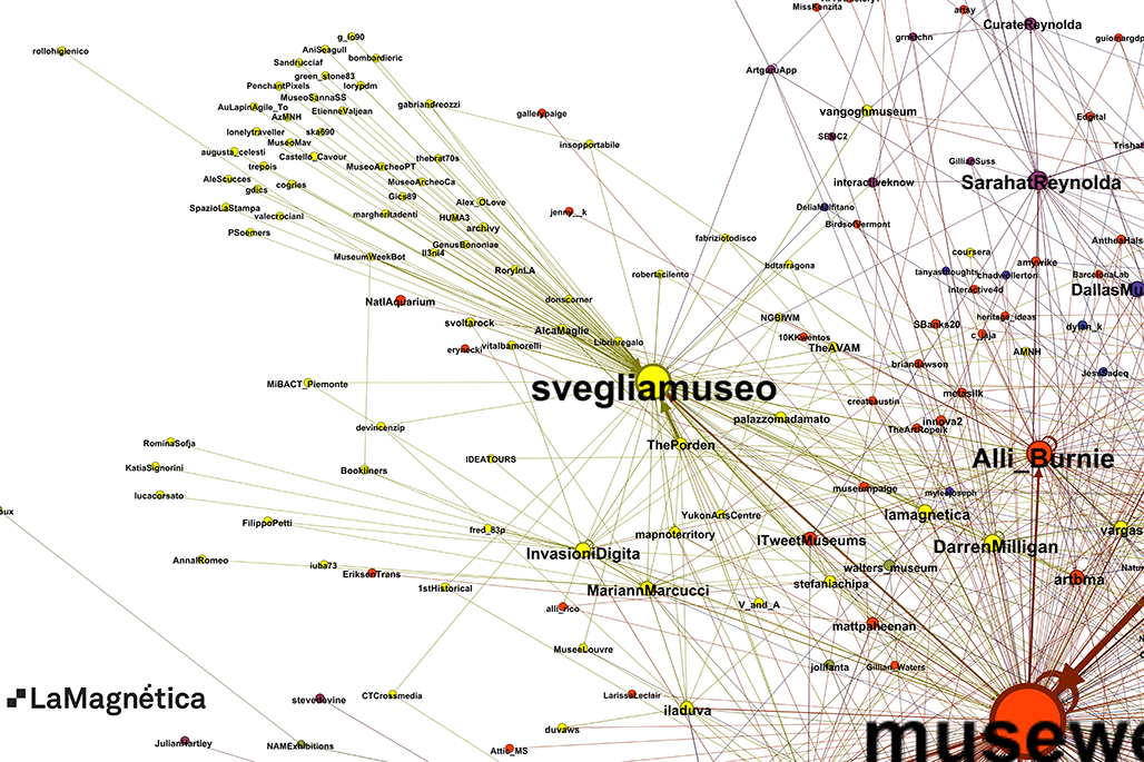
- The only differentiated group, the yellow one, is formed by Italian Twitter users. Most of the Italian people tweeting about #mw2014 or mentioned in tweets were not in the conference. They have been kept up to date thanks to svegliamuseo, as you can clearly see in the detailed graph below.
Here you have a high-resolution image of the grap: Download
To further analyze the network structure, we focus on the link density and distance between nodes. The distance between two nodes is the number of links of the shorter path between two nodes (users); while the diameter is the maximum value distance among two network nodes.
The #MW2014 network has an average distance of 3,55. This value, significantly low, has its explanation in the graph structure, where one user (museumweb) acts as a central node, connecting the majority of users. The underlying fabric of connections of users previously related to each other, also influences the result, but to a lesser extend than the key role of @museweb.
The diameter of the network is 8. Had we excluded some peripheral users that probably were not in the conference, but following it from a user from their own country (like the Italian case highlighted above), the diameter would have probably been 6.
If we pay attention to the amount of mentions sent and received by each user we can see that, on average, each one is involved in 4,88 mentions (that include both sent and received mentions). Of course, the fact that some profiles have generated or received lots of mentions makes this value difficult to analyze, because is a variable very unevenly distributed.
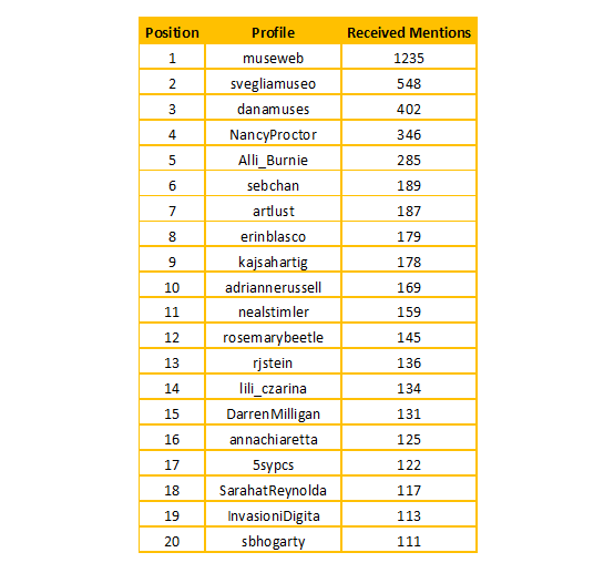
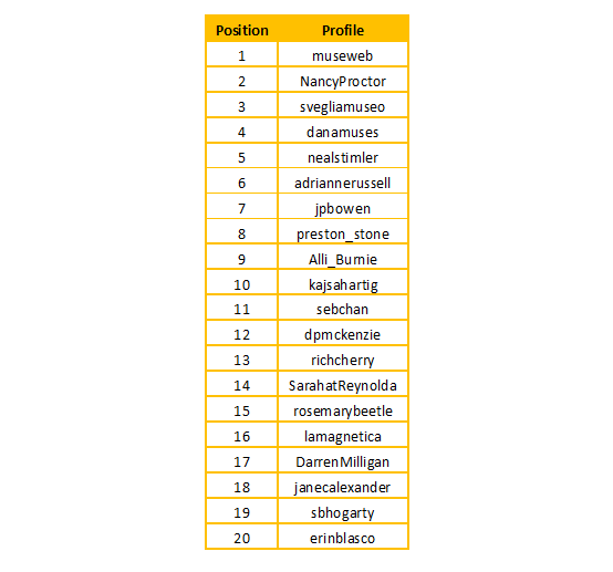
We are going to see which profiles have had a bigger relevance around the #MW2014 hashtag, and to do so we will use two ranks. The first one is a rank by mentions received. The second one, on the other hand, refers to the centrality of the profile.
The first measure is related to the perceived relevance of a user according to the number of times it is mentioned or retweeted, while the second one is more representative of the centrality of a profile in the conversation. There are not huge differences between them in this case.
Ranking by mentions received:
Ranking by centrality:
[1] According to Topsy.com, this represents a 90,19% of the total amount of tweets with the hashtag #MW2014.

