
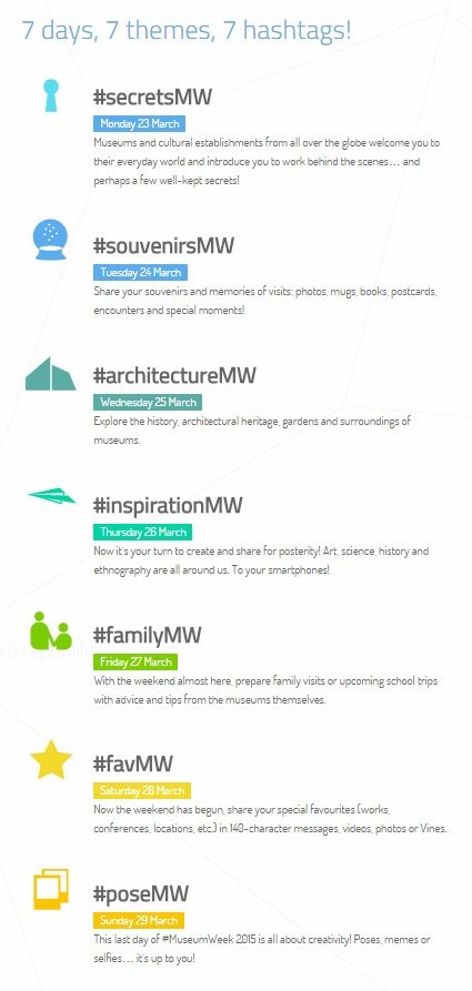
We have been monitoring all tweets around the Museum Week since a month before the event up to the end of March. This year Museum Week has used 7 different hashtags, one for each day (from March 23rd to March 29th) plus the general one: #museumweek.
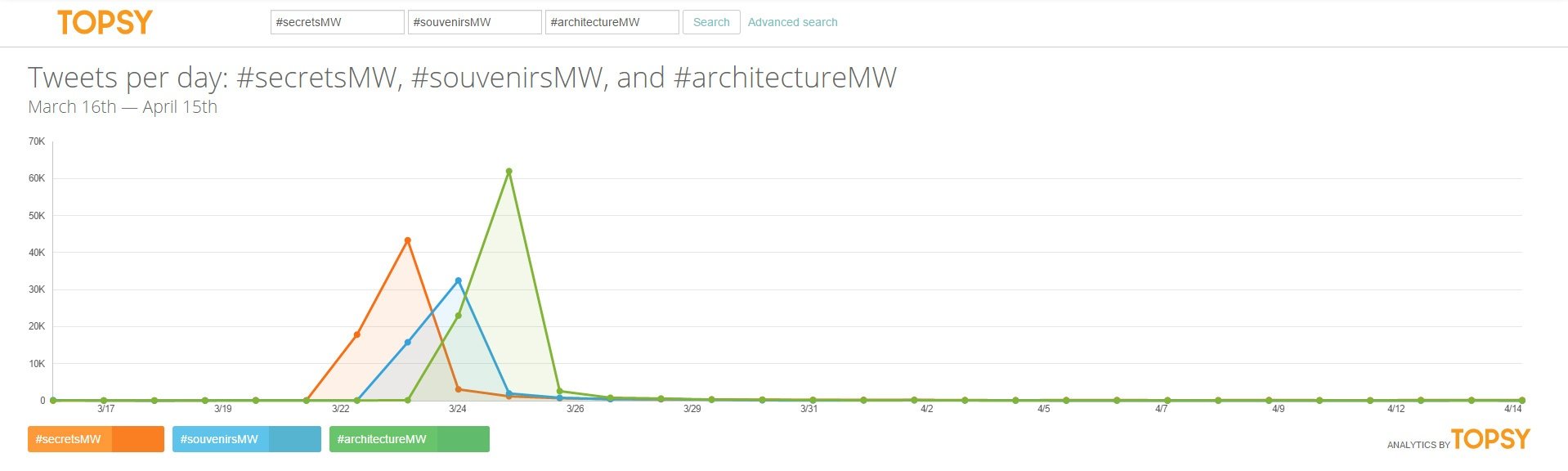
People have followed the suggested rule and most of them have changed the hashtag, as it is shown in the following Topsy chart, where you can see the first 3 days:
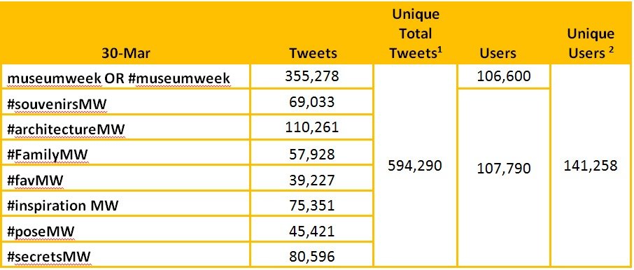
In last year’s Museum Week, 40,000 users were involved (people, museums and organizations), and they published around 180,000 tweets. This year, the figures have more than tripled: almost 600,000 tweets published by more than 140,000 users. There has also been a significant increase in the number of museums engaged in Museum Week.
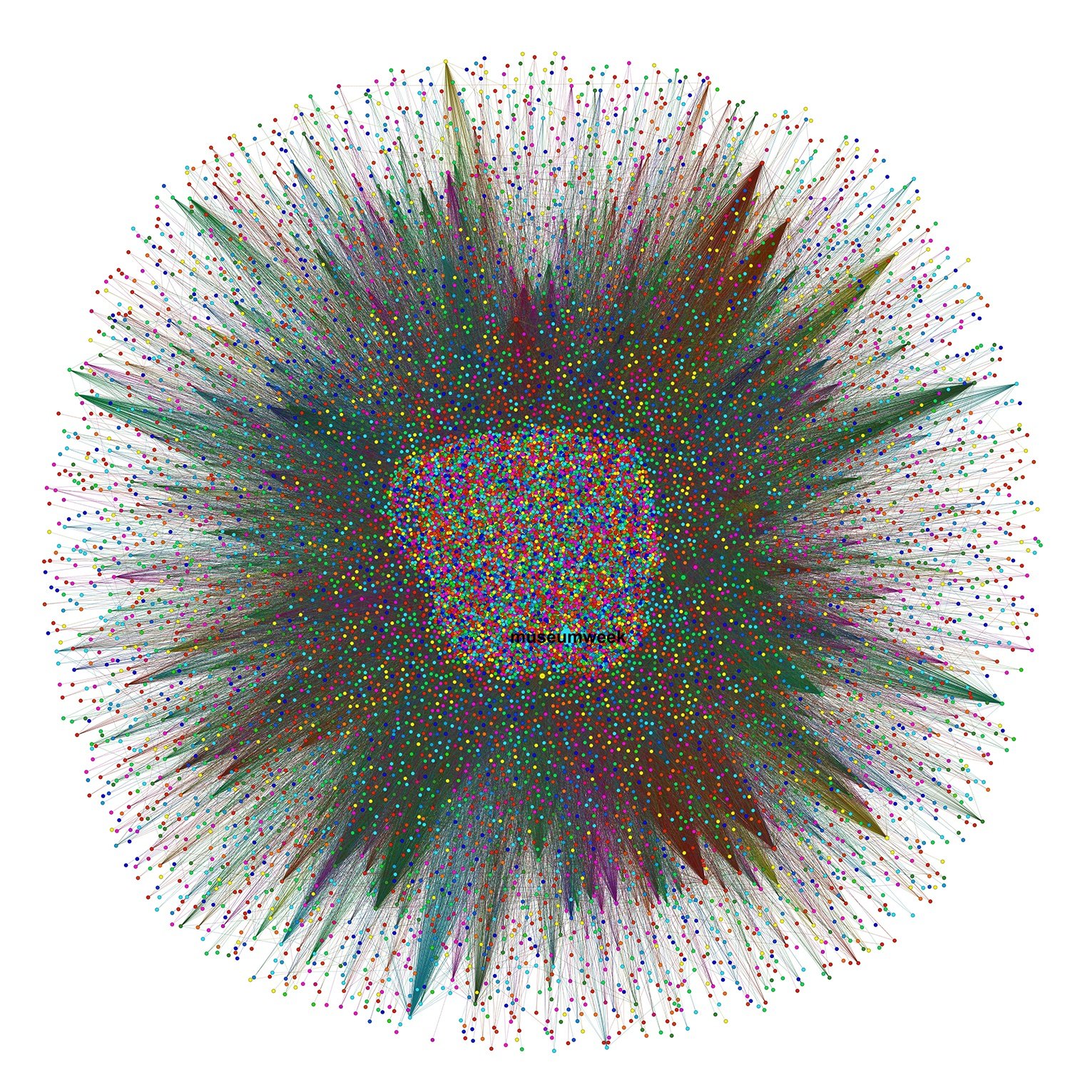
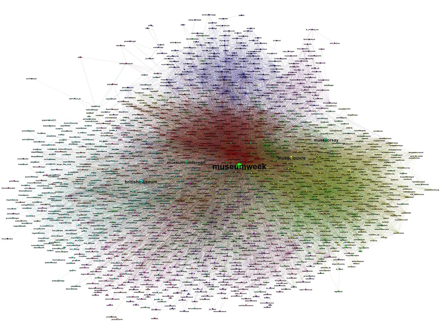 Museum week core graph. There’s a link for downloading high resolution images at the end of the post.
A word about the graphs and their meaning
Among the people that have contacted us to ask for the high-resolution versions of the graphs or to offer some feedback, there have been some questions about what do the graphs really mean and represent. In the following Q&A section, we are going to answer them. If you have some other questions, feel free to contact us through the comments section or Twitter.
What are the dots?
The dots are Twitter users involved in Museum Week. A user has either published or been mentioned in a tweet with one of the official hashtags. The vast majority of the dots are users that have tweeted using (al least) one of the Museum Week hashtags.
What does the size of the dot represent?
The size of the dot represents the influence of a user in the Museum Week conversation (not about its absolute Twitter influence). The dot’s size is not directly proportional to any influence measure. That would have led to huger and tinier dots and less readable graphs.
On the other hand, influence is not the same as having a large amount of followers or retweets, although these two variables help to increase it. We cannot enter into detail without going off topic and devoting a large part of the post to this point, but it is enough for now to say that influence variables try to capture and formalize the naïve concept of the influencer: this is, the capability of spreading information throughout the network; Not only focusing on the number of followers, but on its influence, the parts of the network a user puts together, etc.
What is the meaning of the lines and arrows?
A pair of users is connected with a line if one of them has published a tweet with one of Museum Week’s hashtags that includes a mention to the other user, or if a user has retweeted a hashtag published by another. In a short way, a line appears between two users if there’s been a connection, either by a direct mention or a retweet.
When the connections are stronger we depict an arrow showing the direction of the connection, which can be unidirectional or bidirectional, and in the second case both ways may have different strength. If A is retweeting B’s tweets, the arrow goes from A to B, pointing to B, as B is receiving influence from this connection with A (we can also talk about relevance or centrality).
What is a core graph? Why do we sometimes publish core graphs and not complete graphs?
Some graphs are so huge (as this one, with over half a million dots) that they cannot be properly depicted in a screen in a way that helps to understand the underlying connections. Sometimes it cannot be depicted at all as the number of dots is close to the number of pixels of the screen, and it is impossible to properly represent node sizes, relationships and names.
As an example, see the difference between the core graph shown above, with the whole Museum week Graph below (it does not include user names, otherwise names and dots would overlap):
Museum week whole graph
Even in these cases we analyze the complete dataset and we perform the community analysis, the influence rankings and the calculation of the descriptive measures referring to the whole graph (such as the average distance, the diameter or more sophisticated measures as the clustering coefficient) over all the gathered tweets. This allows us doing two things: improve the accuracy and create a more reliable filtering method to decide which users are included in the core graph.
Communities and how do we detect them in a graph
The procedure is technically very complex and there are different algorithms that analyze graph structures. You can find a brief definition of the main algorithms at Wikipedia, but even with this high-level description, the topic is quite difficult.
The main point is that we analyze the graph structure, split it in different communities and then (and only then) label them. In fact, the list of communities is the result of the analysis; so, if we talk about a French community is because the graph structure shows that there is a distinct group or community whose members are mainly French. That does not mean that all French users are in this community or that all users in the community are French, but most of them are. Sometimes, the communities that we find are related to language rather than country, and Belgian museums and users, at least those that are francophone, may be included in the French community. Other times countries with the same language tend to form separated –although connected- communities, as in the case of the UK and the US.
So the resulting division has not been decided beforehand; it is the result of the analysis and the name is just a label to easily refer to each community.
Component
Nobody has asked about this one, but it is important to understand what does it mean. A connected component is just a group of nodes that are connected through a path; the path may contain as many steps as needed.
When analyzing a museum’s environment on Twitter, as in our 2015 Museums and the web paper, the data gathering procedure is defined in such a way that all resulting Twitter users belong to a single component. But in an analysis like this one, we can have a lot of isolated conversations. Most of them are small clusters formed by less than 10 people (many of them formed by just 2 or 3), but some may have a few hundred users.
In Museum Week 2015 there are 1,147 of such groups, and last year the figure was even larger: over 3,600. What is important in the case of Museum Week is that the main component includes most of the graph, in our case a 97,6%. When we have such a result, the main component is called a giant component.
Museum week 2015 vs 2014
Let’s compare some of the main graph variables between MW15 and MW14 (don’t be afraid by the numbers and some strange jargon, we are going to explain them):
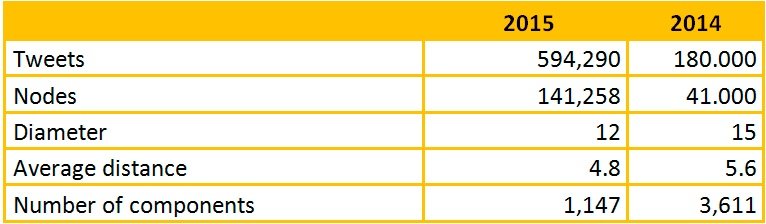
There are a few things that stand out to the experienced eye. 2015’s conversation is much larger, yet more compact. This is a good starting point to understand what’s happening and how has Museum Week evolved since last year:
- Both the number of users and the number of tweets has tripled – the exact factor is 3.3 for users and 3.4 for tweets.
- Last year, around 600 museums from few European countries participated, while this year Museum Week has involved 2,800 museums from 77 countries all over the world.
Despite that:
- The diameter –that is, the maximum distance between two users in the main component- is lower this year: 12 (15 last year)
- The average distance, (this fact is more relevant than the previous one) is also lower, almost 1 step lower than in 2014. That means that we have tripled the number of users but the connections have grown in such a dense way that the average distance is significantly lower this year. (Usually the bigger a graph becomes, the larger the average distance results, although it does not grow proportionally.).
- The number of components has dropped from 3,600 to 1,150, although in both cases there is a giant component that includes all the influential ones and most of the users within the Museum Week conversation.
All these data points out to a more cohesive action and to more cross-country connections. This is even more remarkable if we take into account that the increase has not only been in participants, but in the diversity of them (continents, countries, languages).

